Overview
In this case study, I am aiming to share my end-to-end design process for helping individuals to embrace sustainable habits with an online natural produce platform. Also, I have developed tools and scenarios for the benefit of my own research methods. And, later the results of design research applied in my designs.
This web design project is called One Green Planet which deals with a hot and important topic of day-today: our world is overloaded with plastic and this issue shouts for global attention. The website tells people more about the problem, its influence on nature and our future, and informal about the ways to solve it.
As the digital literacy rate in India is growing, the demand for organic food in India is witnessing good growth.
The number of internet users in India has surged from 260 Million in 2015 to 525 Million in 2019.
We all know about the physical effects of food on our body but flashback to 2010, how many of us knew that the foods we eat have a significant impact on our mental health?
I remember the first time I read an article on Nutritional Psychiatry, I was stunned.
"I mean the pizza that I crave every night could be causing me depression? Whoa! This was huge for me".
People are becoming aware of the harmful effects of chemicals and fertilizers used during farming in India.
Hence, there is a significant rise in the demand of organic produce in metro cities across India.
OneGreenPlanet. Is One word. Here you’ll discover a 360-degree approach to wellness that weaves the mental, physical, otherworldly, enthusiastic, and environmental perspectives of well-being together since we accept that these columns of health are all interconnected.
Whether you take small steps or huge leaps towards green living – every action counts towards reducing your environmental impact.
One Green Planet is an online guide to making conscious choices that help people, animals and the planet.
Main objective is to cut through the green noise and provide high quality resources, experiences and product recommendations that empower people to reimagine the way they eat, buy and think.
The future may appear very grim for the planet as we know it at times, and the problems overwhelming. Attempting to do something about it might not succeed, but doing nothing will most certainly end in that grim future occurring.
Most of us have the ability to do something – so why not give it a red-hot go? After all, there is no planet B. Making an attempt to go green doesn’t have to cost you (in fact, you can save money), but not doing so will cost the environment.
Objectives
Main motives for this case study:
- To design a responsive website that solves problems that users may have with regards to environmental sustainability.
- This product isn’t supposed to save the world, I focused on what would allow for our scope to remain both broad and feasible: environmental education.
- OneGreenPlanet is a responsive website with an engaging informational destination for environmentally-curious users.
- Took full ownership by creating user-centered designs, conducting user research, and implementing design solutions that improved the overall user experience.
- To create OneGreenPlanet as a way of giving users easily digestible environmental facts, and promote consistency through detailed information which will be helpful in their daily lives.
- Identify areas of opportunity for future content creation.
Design Stages

The Problem Space
Problem Statement
I began by assuming that people who live in the city face physical challenges that prevent them from making consistent environmentally-friendly decisions.
There’s no denying it – our beautiful planet is in trouble.
On top of the much-discussed climate change, planet Earth is threatened by air pollution, scarcity of water, deforestation and animal extinction on a large scale.
And the environmental changes are affecting our health – through the quality of the air we breathe, the water we drink, the soil that grows our fruit, vegetables and grains.
People are generally aware of the climate crisis and want to make a difference.
They are starting to feel the impacts of climate change through changing weather patterns, rising sea levels, and rising greenhouse gas emissions.
Presently I’m not a no-waste eco-warrior who only eats organic produce from the veggie patch.
A bit like numerous other individuals, I have a limited amount of energy and assets to get everything done.
But recently I have begun taking modest steps in a more environmentally friendly direction.
Since it matters – not just to the earth and its future residents, but to my family’s wellbeing nowadays.
Let’s have a look at:
- Why being a green god(dess) is good for our health and which eco-friendly actions help users to begin taking nowadays to create a positive impact?
- How might we alleviate the challenges brought on by physical obstacles to help users meet their environmentally-conscious goals?
- How might we engage people to act in an environmentally conscious way and inform them of the benefits of their lifestyle choices?
User Research
The Goal of Research
Understanding how users navigate environmentally sustainable/conscious choices, and if they do not, I wanted to know why.
User Interviews
Our ideal user works or lives in the city, is concerned for the environment, is not an expert, and is interested in learning more.
After screening for qualified users, I conducted 4 remote interviews through video call, and 1 in-person interview.
I inquired about their recent environmentally-conscious behaviors, why they believe they are not always consistent, where they receive their information, and their motivations for being environmentally conscious.
Our initial speculation that an urban environment ruins natural activity was totally debunked.
I talked to users who felt the city has noteworthy environmental incentives, they were just uncertain of what they are.
Users were uncertain of how precise their knowledge was, and so needed steady practice in simple activities like recycling.
It was our initial hypothesis about people's awareness and actions valid?
Some interview questions were, for an instance:
- What is blocking you from doing more for the environment?
- What was the last thing you did that you consider environmentally friendly?
- Do you feel that you know which personal actions have more environmental impact than others?
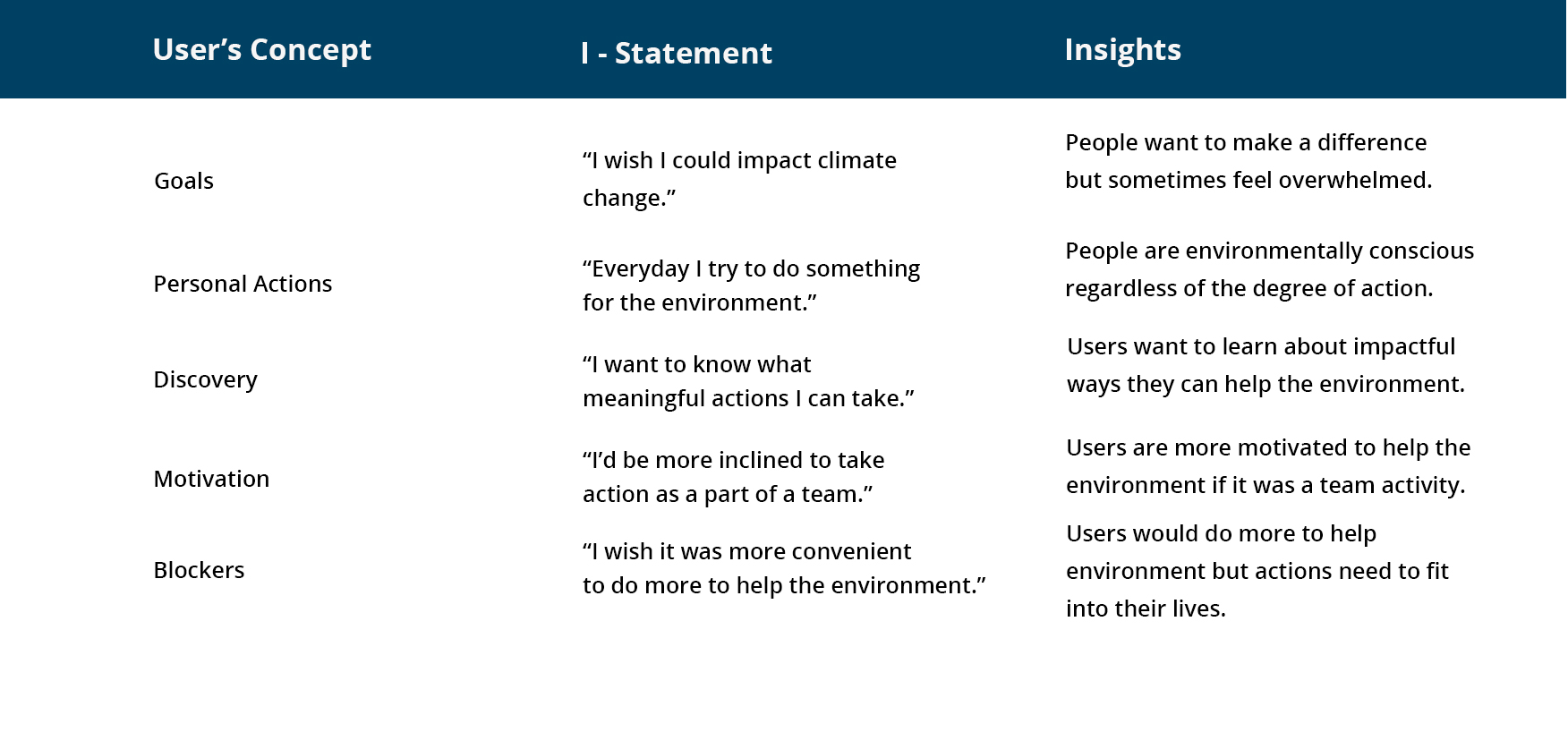
Ultimately, I learned that:
- Users need clear actionable tasks and goals to help the environment.
- Users often don't know what the actual impact is of their individual actions to help the environment.
- Users would be more inclined to take action as part of a team.
- Advise users on which of their actions would be most impactful.
- Address user concerns over motivation and habit-forming.
- Users want to make a difference but sometimes feel overwhelmed.
- Users want to learn about impactful ways they can help the environment.
- Users are more motivated to help the environment if it's part of a team activity.
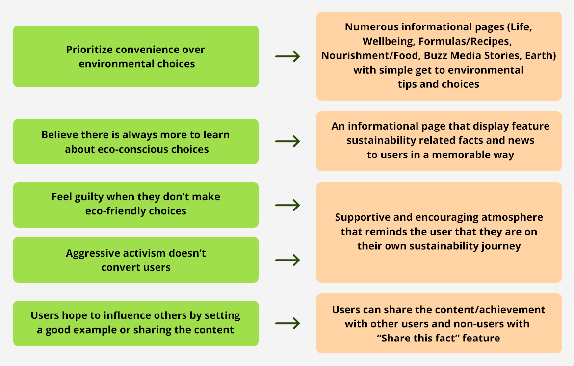
- Users prioritize convenience over some environmental choices.
- Users believe there is always more to learn.
- Users feel guilty when they do not make eco-friendly choices.
- Users are discouraged by aggressive activism.
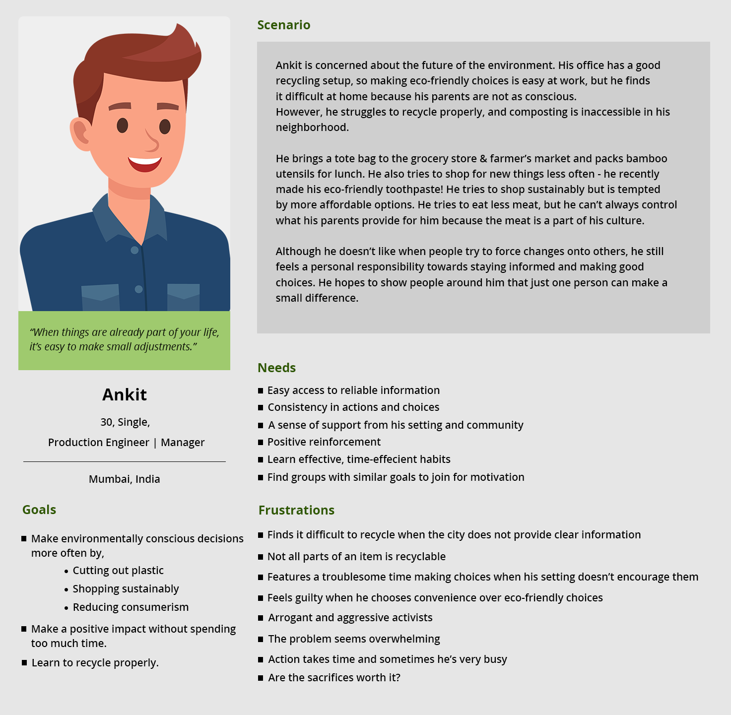
Representing Our Users
From these insights, I was able to meet Ankit, who represented our typical user. Ankit would like to do his part for the environment but is not confident in his knowledge (i.e. recycling), nor is he consistent in his actions (choosing fast-fashion over sustainable brands).
With Ankit's intellect, I created a Journey Map of his enthusiastic involvement encompassing environmental choices and considered focuses where I can intervene.
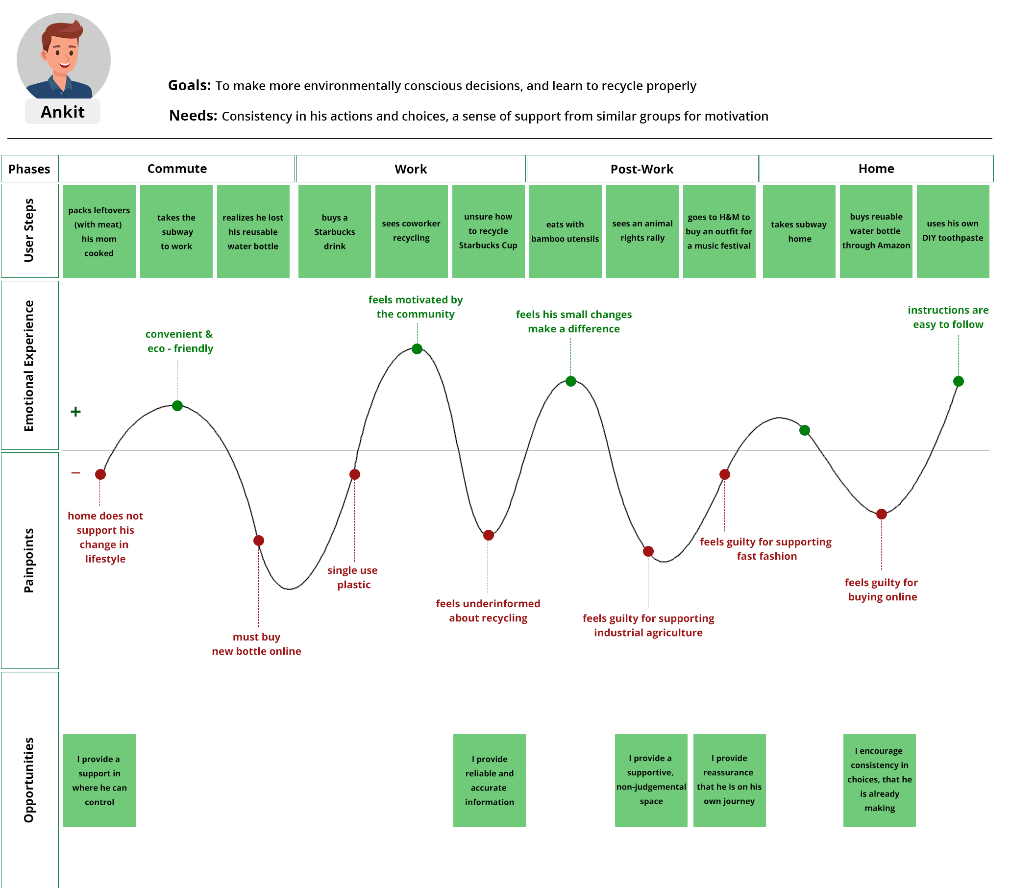
Ankit's least emotional focuses are when he feels guilty choosing comfort over sustainability, or when he feels under-informed and thus does not make an environmentally-friendly choice. I sharpened in on the potential opportunities for Ankit to get to environmental data on the go (i.e. when he should recycle in public spaces). I moreover considered intervening when he is stationery/at home and potential ways of making a difference in him building up a schedule.
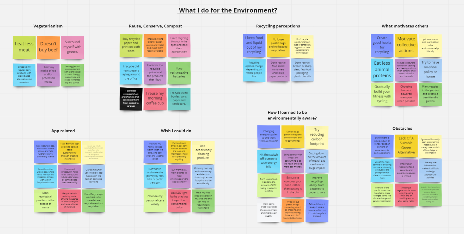
Affinity Map
An affinity map is often used to group similar observations together. I used it to surface several key issues common amongst participants.
Revisiting the problem statement
Ankit as of now tries to create environmentally conscious choices, however, he believes there's continuously more to learn.
He frequently finds himself choosing between comfort and environmentally conscious options.
He finds it simpler to be eco-friendly in a strong way.
How might we offer assistance to Ankit to remain informed, reliable with his choices, and sincerely bolstered in his endeavors to improve his environmentally conscious way of life?
How might we help Ankit be a better, more informed global citizen and develop life-long habits that benefit the planet?
Feature Consideration
As we have begun moving into the design stage, we reevaluated what highlights can be optimized through a responsive web design, and how Ankit would carry on unexpectedly on mobile vs. desktop. We desired that Ankit would likely benefit from convenient data on his mobile; if he needs to dispose of a soda can and needs fast recycling rules, he seems effortlessly discover the information on the go. On the other hand, if he was using a desktop view, he most likely has a stable web connection, maybe more leisure time, and thus may benefit from an interactive feature.
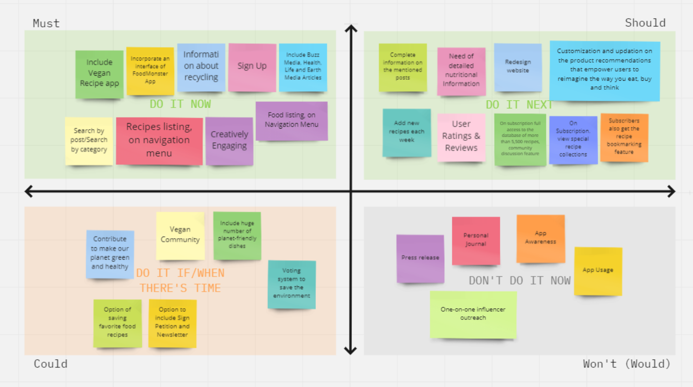
In order to decide what features our minimum viable product (MVP) must have, should have, could have, and won’t have, we used a MoSCoW Map. We narrowed down our necessary features to:
Informational pages
Since the objective of our product is to assist Ankit to remain informed and be reliable, our product would have no value without informational pages.
Articles upon Buzz Media, Wellbeing, Life, Earth, Nourishment and Recipes
These articles would provide detailed environmental facts which can be competent in an interactive way and covering numerous or all vital points of a subject.
Sign up, and Objective Setting
We get it that environmental action must be inherently spurred, and based on users, able to set objectives for themselves that would empower consistency in being more ecologically proficient.
A Warm and Empowering Atmosphere
Hyper-aggressive activism discourages Ankit, he feels guilty for his need for knowledge and action. To counter this, our product will have a supportive atmosphere, empowering to urge to know new things every day and emphasize self-progress and development.
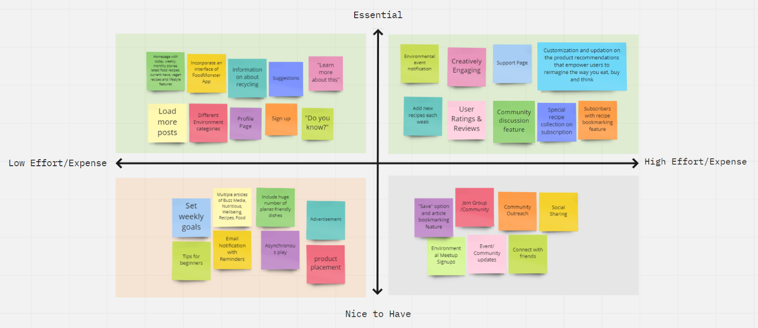
Information Architecture
I started with IA, simply because the users need to be able to FIND content before they can USE it, more exactly findability precedes usability.The map and IA advised the key screens that I created as a low-fidelity wireframe.The sitemap helped me determine where content should go and how it should navigate within the context of the web application. Here you can get a glimpse of the breadth and depth of the navigation.

Design & Testing
Prototype
I created a few low-fidelity screens for the first round of user testing session.
While creating these screens I focused on:
- Leveraging existing mental models of people, because we approach every new system with a mental model in mind and we presume how the system could work based on our experience with other systems that are similar.
- Minimizing users’ cognitive loads and decision-making time
- Maintaining consistent standards
- Keeping things intuitive and avoiding cognitive friction
- Making design choices that will be efficient and engaging.
- Providing context, showing how everything interconnects.
- Not hiding important features and information.
I carried out a round of design, where I rapidly iterated our MVP screens for our mid-fidelity design. Environmentally impactful action can take place at home, at work, on the street, on vacation, almost anywhere. During interview, our users communicated a preference to using a desktop application for discovering and managing environmental action. Once we collected our insights and determined their corresponding features, we got to work on our Mid-Fi screens and prototype. We focused on the following features for our first MVP:
- Informational content
- Community texting
- Shareable content
In order to validate our design choices, I conducted 2 rounds of usability testing with five users each round, and iterated in between rounds as needed. With our scenarios and tasks written, I conducted our first round of usability testing with our mid-fidelity prototype. Some important things we learned from our first round of testing are as follows:
- Users could not differentiate between the informational content on each menu page and to further view the posts with more options.
To resolve this, I incorporated the load more options, and the options to share the posts on social media. - Users were confused with a lot of posts on the homepage, without the menu tags, in which posts talk about what informational content.
To resolve this, I included a tag like Recipes, Buzz, News, Health, Life, Nutritious, Food, Earth, Animal, and this helps users to get into the depth of the content.
High Fidelity Wireframes
Usability Testing
After iteration of high-fidelity prototype, I conducted a second round of usability testing. During our second round, I found that our users had an overall success rate of 74% and rated each tasks below a 2 on a scale of 1(easy)–5(difficult).
From our second round of usability testing, our iteration of adding menu tags on each post or informational content helps users to get into the depth of the content and decreased the confusion for our users.
However, I also found that users were still unable to directly locate the “recipes going viral” page.
The recommendation from the first round was to move the "recipes going viral" page into "recipes going viral" posts on homepage. After the second round, it was recommended that it be moved to the “Recipes” page, where most of our second round users expected it to be.


Moving Forward
Our following steps would include:
- A second iteration in high-fidelity
- A third round of usability testing
- A/B testing to see whether users prefer/expect “Recipes” to be shown as a different page
- Placing a greater emphasis on community by implementing blogs, forums, reviews & ratings, subscription, petitions, support.
FoodMonster App with Preview, Features, User Reviews and Press Reviews
The overall user interface design was kept minimal to ensure users don’t get overwhelmed using the application.
Working on OneGreenPlanet application was really interesting as well as informative.
The research conducted to absorb the domain knowledge proved to be really valuable.
Not only I learned the pros of organic food consumption but I also got to know the nuances of 360-degree approach to wellness that weaves the mental, physical, otherworldly, enthusiastic, and environmental perspectives of well-being together.
In this case study, I covered an online guide to making conscious choices that help people, animals and the planet.

Learnings
At times user preference takes precedence over usability best practices
As a best practice in usability, it is best to avoid a dropdown if you have to show a handful of input options.
In my case, I had only few input options to show recipes and other posts.
Since users were more familiar with not selecting the posts, they preferred it over an upfront like feed/posts.
Want better feedback from users early on? Use original content copy
In case with the paper sketches as well as low-fidelity wireframes, I tried to incorporate the original (or close to original) content copy with them.
It proved to be really valuable while performing the usability tests on the wireframes since users were able to relate more closely with the actual product.
Conclusion
As aforementioned, buzz words like “sustainability”, and “environmentally conscious” are heard everywhere.
Making changes to a lifestyle is like learning a new language for a lot of people, and similar to learning a language, we need to practice and be consistent if we ever want to be proficient.
Hopefully there will be more websites and resources that make environmental education more approachable so we can all be a part of the conversation around sustainability.
P.S. I strongly believe we need to raise awareness between the climate crisis and animal consumption in every way we can.
